Monday 9 May 2011

Final Piece Self Identified Project

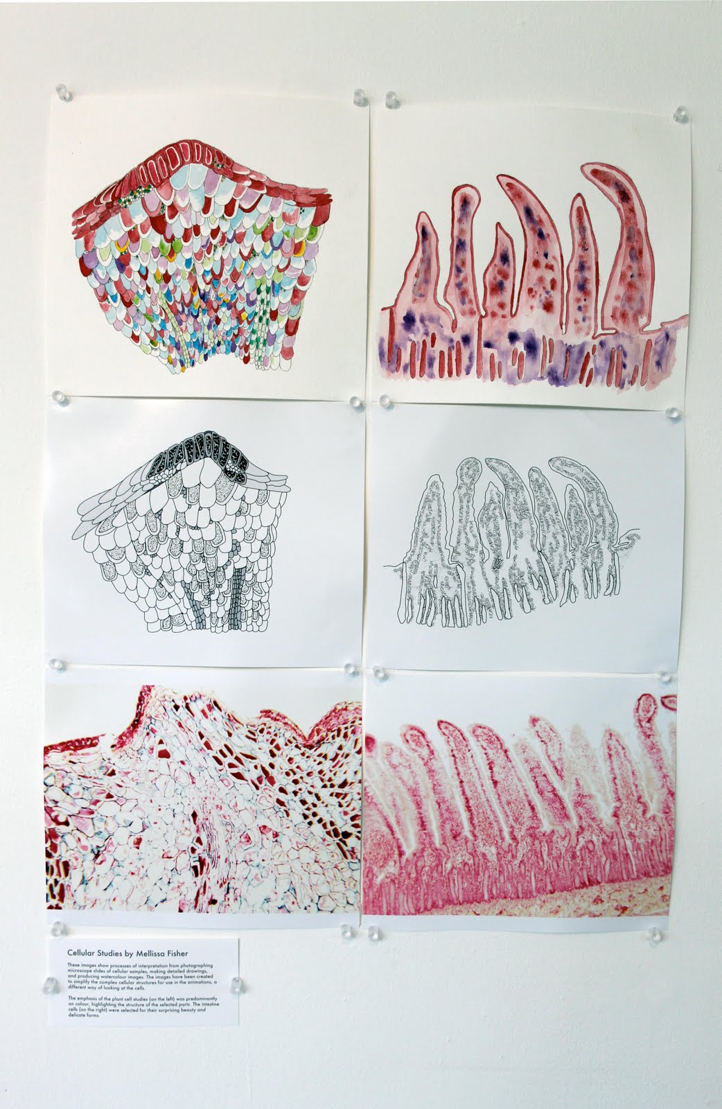
For my final piece I decided to combine two cells together to make one. I expanded the watercolour study I did for the Broad Vision Exhibition onto A2 to show all the colours and patterns I have seen down the microscope.


Thursday 5 May 2011

Broad Vision Exhibition

For the Exhibition I showed my water colours studies of plant cells and the intestine cells.
These were then used for the animation.
This is my favourite study i've done so far so for my self identified project I want to do it on a larger scale.

Also shown is the animation I helped make with two computer science students. Unfortunately the animation is not entirely finished but still looks the part.


Other work in the show:


This is my favourite piece of work by Alish in 3rd year Illustration.

Wednesday 27 April 2011

Animation Done

All done for the Broad Vision Deadline


Friday 15 April 2011

Time Lapse Experiment

For my research I decided to create a time lapse experiment of mouldy jam under the microscope. I did this over the weekend and the camera was timed to take photographs every 5 minutes from friday to monday.

The results were blurred because obviously the microscope has to stay in focus and instead of the mould spreading sideways which is how i hoped it would, it grew upwards, making it more and more out of focus as the film goes on. Still, here is the video. (including test shots at the start)


the three stages.

Monday 4 April 2011

New Brief

We have finally been given a project that allows us to do whatever we want! Which is what i've wanted to do for a while. So, since Broad Vision started back in October i've collected A LOT of images that i've taken looking at cells down the microscope. I really want to continue the microscopy art so I've decided to do my Self Identified project on this. I will show my experience of Broadvision in my sketchbook and have mostly water colour studies of cells. I will also be planning to have experimental sketches with all sorts of different materials and textures.

I am also including the animation that I am co creating with two computer science students in the project Broad Vision as it shows cellular activity and links with the work I will be doing for this project.


These are some previews of the photographs I will be illustrating/painting.


Wednesday 30 March 2011

Sunday 27 March 2011

Animation Progress

So far the animation has gone well, unfortunately there has been a lot of mis communication as to the requirements of the animation. The main focus is the cells but the background needs to change quickly as it looks really bad with the red. Trying to convince two computer science guys to do something pretty, is difficult.


little bit better.
The start of the 2D flash animation

FINISHED TYPEFACE

Haven't written in here in ages, but will be uploading all the work i've done before monday (deadlines)

This is my finished typeface.


GRAPES!

That's what I decided to do my typeface on in the end.

I painted each letter with watercolours.


And to the quote using my own typeface.
Quote: George Clarke 2011

Saturday 26 March 2011

Online Brief: Website


The brief is to design a homepage which integrates your blog and other social networking tools such as twitter and facebook.

I want to create a homepage that is visually stimulating to others and personal to me. My aim to to make it look professional but playful at the same time... my drawings are all about the bright colours or block colours and the 3D doodles I tend to do.

To start...

To develop my menu designs I put them on illustrator and just played around with colours. I want to use my typeface in my design as well so i've updated my work to show how.

I decided on these three menus, but i really like the green menu as it's the least complex drawing there!


Layout Plans

I played around with a few different layouts but had trouble with settling with an idea.. I also lost all my progress work halfway through doing it (bloody mac) but luckily I printed everything as I went along! so the quality isn't great.


Friday 25 March 2011

Type Experiment

I thought of the classic potato stamping, I have a lot of alphabet stamps but it'd be nice to actually make something on my own. As it's been about 15 years since i've done this I made the classic mistakes of getting the letters round the wrong way and not flat enough to print the whole letter. It took some experimentation and lots of slapping my forehead.


I tried different ways of cutting the potatoes but I have found a way, MORE TO COME.

Thursday 24 March 2011

Type Reserch

My housemate (a graphic designer) showed me this, isn't it nuts?

By Dalton Ghetti - Pencil Tip Micro Sculptures.
It got me thinking how I can show type in a different way, I said before about carving type into fruit which I am yet to do. maybe carving into leather? I'd rather sculpt something than arrange things into the shapes I need. Might try using images soon to see what I prefer..

Broad Vision Update

These are the two images I have done for the animation i'm doing with three other students at the NCS campus.

This drawing is of a plant cell and i'm hoping when it's all put together that it will be pulsating a bit and the little bubbles around the edges of the scale like part of the cell will move around the entire image.
This is the drawing for the intestines, I found out (with help from housemates) that the intestine cell moves from side to side very quickly pushing things past as they go around. The little shapes at the bottom of the image should be moving up and down as well.

More info soon.

Typography Research

Also on Booooooom.com -

Maricor Maricmanalo
I really like this use of type it seems symbolic to me, which is why it caught my attention.

Play GROUND
I've been trying to use different styles on each letter of my own typeface recently, but nothing ever seems good enough. I need to doodle more.

Sasha Prood
Very familiar with this artist work on type, I have a typography book called 'Hand Job' which has all sorts of different types in, totally need to go through that now I think of it. More research to come.

Unknown artist on google images...


GOOD WEBSITE

http://dornob.com/found-built-typography-10-real-life-physical-fonts/

Font Brief.

BRIEF
Take photographs of shapes, objects, and the landscape around you. Use ONE
object or image you have photographed to create a complete font.
Treat your typeface the same as you would treat any other illustration
brief. Consider who it's for, where it will appear, and what its' purpose
is. Make sure it is appropriate for the audience it is intended for.


To start off I took three things from my room that I thought would make interesting type.

I found the grapes were really easy to make into type and do look pretty awesome... but I reckon I can find something a bit better. I thought about carving into fruit each letter and making say an orange covered in type.
Multicoloured pasta is a bit of a bitch to try and get it to stay still, don't like this idea much.


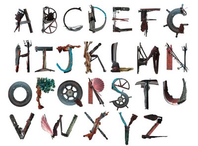
When I thought of this object to use I thought it was the best idea EVER, but then when I actually got to it, I realised how inflexible the model is. The letter 'N' was impossible. and most of the letters don't look very clear, but still, some research.


MORE TO COME

Finished Zine

My finished Zine.

The first page shows all the mould we have in our house and the dates of when it all started. and the second page shows the tacky but kind of cool lights in our house, possibly the only nice thing that is in our house.
The third page shows the recycling pilled up outside in the snow over christmas, we never take our recycling on time, as i'm sure most other students forget to do. (not just us i hope)
The fourth page shows my lovely and probably famous by now, hamster Bovril, because she makes the house better despite the shit hole it is!
I wanted the cover to be as plain as I could as there isn't much to our house. I might try and get the cover a bit mouldy as well, if it isn't too much of a health and safety risk.

So there you go, a Zine about the ups and downs in Sedgecombe Avenue.


ZINE PROJECT

Okay, minor delays getting this blog up, but here it is, the progress of making my Zine about my house as i've been quite ill. The locations I had already taken photos of are the instax photographs, i've also added extra photos. The general idea for my Zine was the state of my house... we have a massive problem with dampness and mould growing we also have random crap in our garden that we've either, stolen when we are drunk, found in the loft, or actually bought ourselves.
putting images together on each page.


We were asked to focus heavily on typography, so I got all the alphabet stamps I could find between me and another housemate. I've done a lot of experimentation of type that i've done myself as well.

I started the type about mould and damp, which pretty much sums our house issues up.
Making the cover for my Zine.


First two pages done!


Developement
Photoshopped images of our tacky tacky lights.
Progress photos for first page


Final page 1


I only took photographs of the process of the first page rather than to each page of the Zine as each process for each page is exactly the same, but just with different images and different type. I didn't use type as heavily in the second half of the book as I thought the images were more powerful and type would kind of ruin them.